Understanding CPU Flame Graphs
Many companies rely on Node.js and its asynchronous paradigms to enable performant, real-time software applications. If these applications are customer-facing or internally relied on for critical business functions, performance is not simply a bonus but a requirement. For any of these mission-critical applications, the importance of being able to quickly identify the source of a performance issue can not be overstated.
For performance issues related to (or suspected of being related to) CPU usage, CPU profiling, the sampling and logging of an application’s function call stack as it relates to time on-CPU, is an important tool as it helps developers gain granular insight into their applications’ resource usage.
The Flame Graph
Like many before him, Brendan Gregg had a problem. While investigating a customer’s performance issue as Netflix’s Senior Performance Architect, Mr. Gregg generated a stack trace that was 591,622 lines long. Finding this prohibitive, he looked for ways to condense and visualize this information. His solution was “a prototype of a visualization that leveraged the hierarchical nature of stack traces to combine common paths”. With ‘warm’ colors chosen to help visualize CPU ‘hot spots,’ the visualization became known as a “flame graph.”
Follow this link to interact with the original Flame Graph for the nearly 600,000 lines of profiler output
While profiling and visualization implementations have proliferated over the last several years, the N|Solid Console stands out for its rich user interface and unparalleled reliability for generating and consuming JavaScript stack traces.
Generating a Flame Graph with the N|Solid Console
The N|Solid Console has incorporated these profiling and debugging flows to create a streamlined triage process. Let’s use the Console to trigger a CPU profile and generate a flame graph with the data.
The Node.js application for this next example is used for load testing at NodeSource. Depending on the number of mock agents configured to be generated, this application can have a significant impact on the N|Solid Console’s use of CPU.
The steps outlined below will be the same regardless of the application or process:
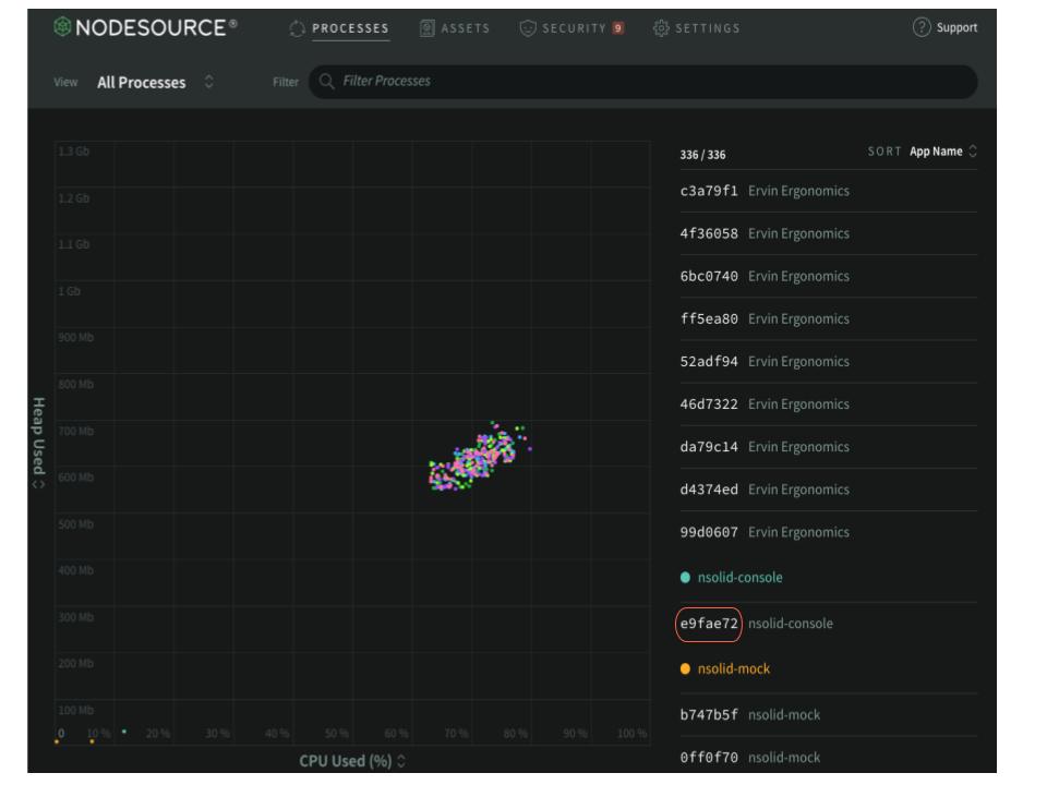
First, select which process you would like to generate a profile for and click on its PID in the Processes List:
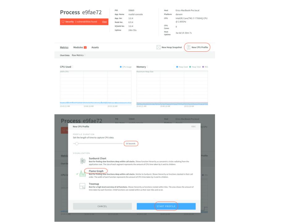
This will take you to the Process Details View. Select the New CPU Profile button and choose Flame Graph as the output type. Use the slider to set the duration of the profile. When configured, select Start Profile and a small banner will confirm that the profile is being generated.
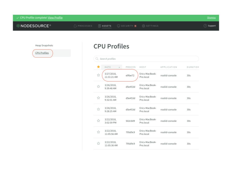
To view the newly generated asset, select the Assets tab in the Nav Bar. Once on the Assets page, select CPU Profiles. Click on the the new profile to be taken to the Flame Graph.
Interpreting the Flame Graph
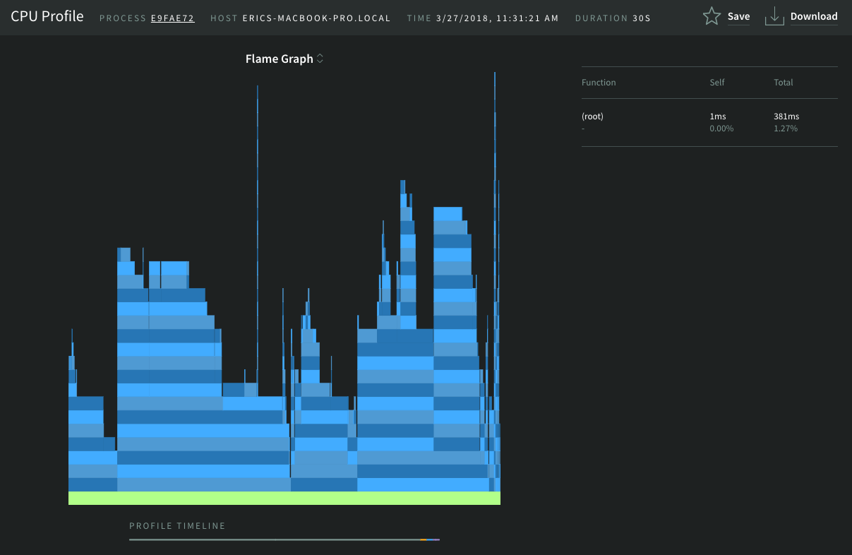
Above is the flame graph that visualizes the CPU usage of the N|Solid Console as it renders the 333 mock agents. The bar that spans the entire bottom of the graph is the function that was on-CPU (the (root) function, in this case, highlighted in the image). Hover over a function to see the function name, and click on it to see the function and its children’s information appear to the right of the graph. As the flame graph capitalizes on the hierarchical nature of function calls, parent functions are lower on the y-axis (closer to (root)), with nested functions appearing higher on the y-axis.
The width of each function on the graph represents the amount of time it took each function to execute as a percentage of the total time of the trace ((root) takes up the full width of the graph).
Some of the function columns are squat, others tall and needle-thin. The dramatic spikes are illuminating with respect to function complexity, but if they are not very wide they are being processed by the CPU quickly and are thus unlikely be the source of a CPU performance problem.
Of particular interest for flame graph analysis are functions that are both deeply-nested (high on the y-axis) and time-intensive (wide on the x-axis); such a flame graph profile is the strongest indicator that a function is improperly using CPU resources and can benefit from optimization. When clicking on a suspected CPU-intensive function, look to the Self and Total times. It is normal for Total time to be much higher than the Self time. If the Self time of a nested function accounts for a large percentage of Total time, this is another indicator poor CPU performance/code optimization is likely.
Alternative Profiling Visualizations
The flame graph is a powerful tool for digesting and interpreting CPU profiling data. It can condense impressively large stack traces and summaries into a user-friendly and information-dense visualization. A downside of the flame graph is that parsing out how much time was spent in a parent function versus its children can still be labor-intensive.
Treemap charts are an alternative visualization for CPU profiles that show parent-child relationships by moving from the outside in. In the figure below you will see the treemap visualization of the same CPU profile that was used to generate the example flame graph. There is a thin, green line running along the perimeter of the treemap ‘square’. This is the (root) function. Time spent in a given function is denoted by area in a treemap.
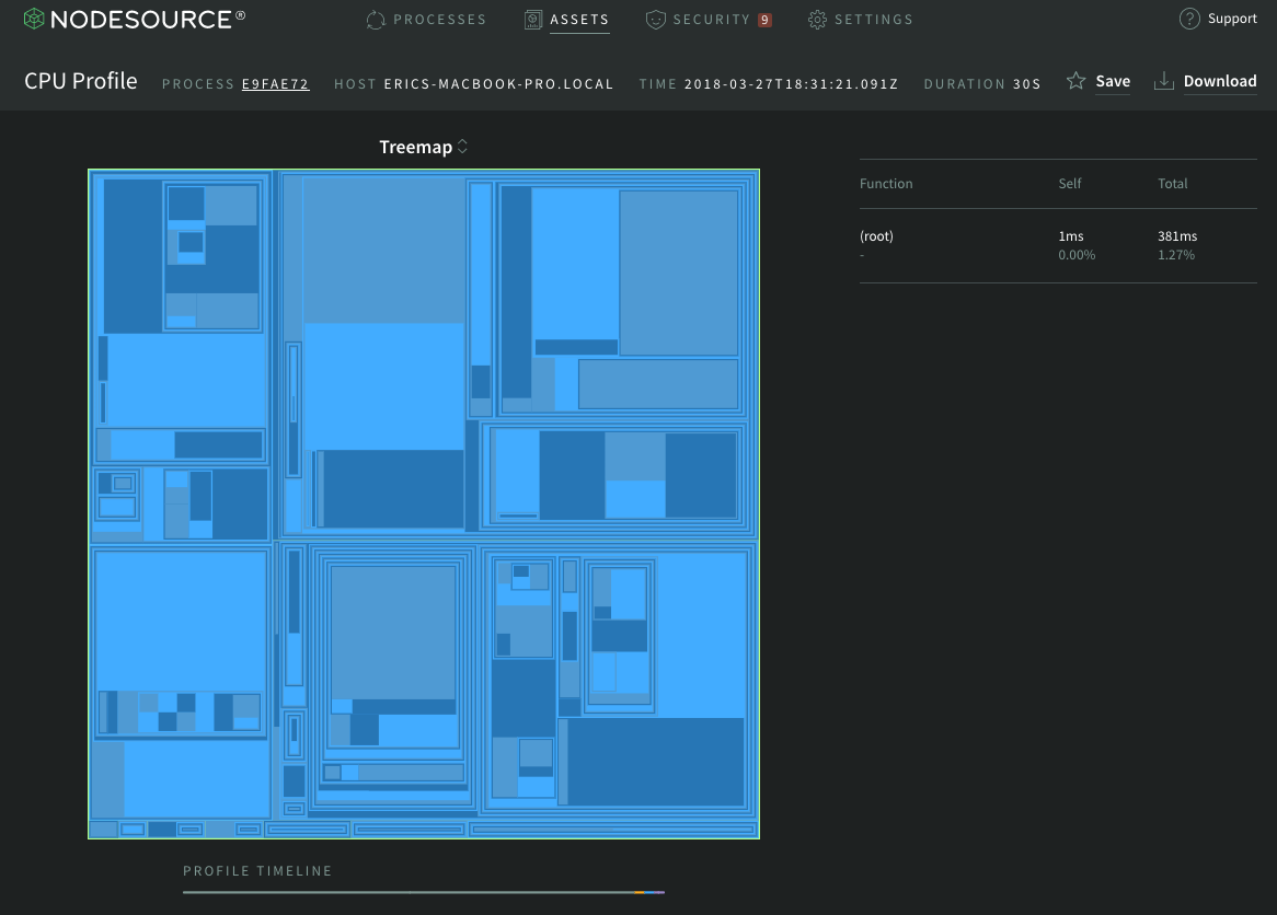
In a flame graph, it is a function’s total time that is communicated by that function’s width. In contrast, in a treemap chart, it is a function’s self time that is communicated by that function’s area. Because time on-CPU can be very explicit in treemap charts, it is a visualization that can accelerate debugging and optimization.
Takeaways
CPU profiling is a resource usage summary tool that helps engineers understand what functions are on-CPU and how much CPU time they are using. Node.js ships with native profiling tools that can generate human-readable stack traces, but a lot of critical performance insights can remain hidden by the volume of data that these tools generate.
The flame graph is a profiling visualization that leverages the hierarchical nature of function stacks to condense this information into a user-friendly interface. There are no core Node.js features that produce flame graphs, but premier tools like the N|Solid Console make flame graph generation quick and painless.
Here are several takeaways to remember when interpreting flame graphs for performance optimization:
- The function on the bottom is the function on-CPU. The higher up the y-axis, the further nested the function.
- The width of each function on the graph represents the amount of time it took that function to execute as a percentage of the total time of its parent function.
- Finding functions that are both high on the y-axis (deeply nested) and wide on the x-axis (time-intensive) is a great way to narrow down performance and optimization issues
- There are other CPU profiling visualizations, such as treemap and sunburst charts.
New to N|Solid?
If you’ve never tried N|Solid, now's a great time to give it a shot. N|Solid is a drop-in replacement for the Node.js runtime that has been enhanced to address the needs of the Enterprise. N|Solid provides meaningful insights into the runtime process, including application performance and known vulnerability monitoring.
As always, we’re happy to hear your thoughts - feel free to get in touch with our team or reach out to us on Twitter at @NodeSource. Thanks for reading Understanding CPU Flame Graphs.